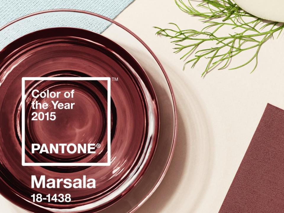
Marsala: the colour of 2015
The colour Marsala derives its name from Marsala wine. Pantone describes it as ‘A naturally robust and earthy wine red, Marsala enriches our minds, bodies and souls.’ Just like wine, the colour has a strong flavour with earthy undertones. It’s an attractive colour which combines well with fashion, design and interiors. It also gives a fabulous contrast with the other colours in the spring palette.
Natural trend colours
Next season the colours will be heading towards the cooler and softer end of the colour spectrum, and follow a minimalist and ‘en plein air’ theme: warm, subtle and natural. They are reminiscent of - amongst other things - retro, floral art and tropical landscapes. The three Pantone colours which are based on nature and which you will encounter regularly this spring in fashion are: Lavender Herb, Woodbine and Treetop.

PANTONE 16-3310 Lavender Herb
We all know lavender to be a beautifully scented outdoor plant with a fantastic purple flower. This unique tone adds an element of surprise to Pantone’s spring colour palette. A creative colour which intrigues the eye and invokes nostalgia!
PANTONE 18-0538 Woodbine
Woodbine is a tropical shade of green which can best be described as ‘nature’s neutral’: the colour of foliage, grass and growing plants. It is a classic yellow-green colour which can be used with everything and everywhere. It’s also linked to our sense of smell - are you thinking of freshly mown grass already?

PANTONE 18-0135 Treetop
Treetop is a natural and fruitful colour. It’s very suitable for use as a background for other colours. This trend colour is a healthy harmonious shade of green that helps us to relax. Designer David Hare was inspired by this colour and used the Treetop shade in his fashion designs for the spring.
Which of these natural colours from Pantone inspires you the most?


